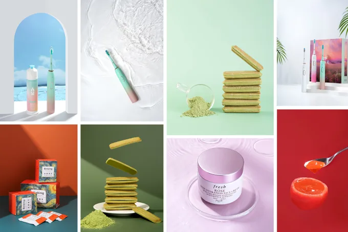

Colors are more than just visual elements—they evoke emotions, influence decisions, and shape perceptions. In product photography and branding, understanding the psychology of colors can be a game-changer. By strategically using colors, you can create a powerful connection with your audience, boost brand recognition, and even increase sales. Here’s a deep dive into how colors impact consumer behavior and how you can leverage them effectively.
Why Colors Matter in Branding and Product Photography
Colors play a crucial role in how consumers perceive your brand and products. Research shows that up to 90% of snap judgments about products are based on color alone. Whether it’s a product photo on an e-commerce site or a logo on a billboard, colors communicate your brand’s personality and values without a single word.
The Psychology of Common Colors
Each color evokes specific emotions and associations. Here’s a breakdown of what different colors mean and how they can be used in branding and product photography:
- Red
- Emotions: Excitement, passion, urgency.
- Use Cases: Red is often used to create a sense of urgency (think clearance sales) or to stimulate appetite (common in food brands like Coca-Cola and McDonald’s).
- Blue
- Emotions: Trust, calmness, reliability.
- Use Cases: Blue is popular in tech and finance industries (e.g., Facebook, PayPal) because it conveys trust and professionalism.
- Yellow
- Emotions: Happiness, optimism, warmth.
- Use Cases: Yellow grabs attention and is often used to evoke positivity (e.g., IKEA, Snapchat).
- Green
- Emotions: Health, nature, growth.
- Use Cases: Green is ideal for eco-friendly, organic, or wellness brands (e.g., Whole Foods, Starbucks).
- Purple
- Emotions: Luxury, creativity, sophistication.
- Use Cases: Purple is often associated with premium brands (e.g., Cadbury, Hallmark).
- Orange
- Emotions: Energy, enthusiasm, playfulness.
- Use Cases: Orange is great for brands that want to appear fun and approachable (e.g., Fanta, Nickelodeon).
- Black
- Emotions: Elegance, power, sophistication.
- Use Cases: Black is commonly used in luxury and high-end products (e.g., Chanel, Apple).
- White
- Emotions: Simplicity, purity, cleanliness.
- Use Cases: White is perfect for minimalist brands or those in the health and wellness space (e.g., Adidas, Tesla).
How to Use Colors in Product Photography
- Highlight Key Features
Use contrasting colors to draw attention to specific product features. For example, a bright yellow background can make a black product stand out. - Create a Mood
Choose colors that align with the emotions you want to evoke. For instance, soft pastels can create a calming effect, while bold, vibrant colors can energize the viewer. - Maintain Brand Consistency
Ensure your product photos reflect your brand’s color palette. Consistency builds recognition and trust. - Use Color Blocking
Group products with complementary colors to create visually appealing compositions that catch the eye.
How to Use Colors in Branding
- Define Your Brand Personality
Choose colors that align with your brand’s values and personality. For example, a fitness brand might use red for energy and green for health. - Consider Cultural Differences
Colors can have different meanings in different cultures. For example, white symbolizes purity in Western cultures but represents mourning in some Eastern cultures. - Test and Iterate
Use A/B testing to see which colors resonate most with your audience. For example, test different call-to-action button colors to see which drives more clicks. - Use Color Psychology in Logos and Packaging
Your logo and packaging are often the first touchpoints with customers. Choose colors that leave a lasting impression.
Real-World Examples of Color Psychology in Action
- Coca-Cola: Red evokes excitement and stimulates appetite, making it perfect for a beverage brand.
- Tiffany & Co.: The iconic Tiffany blue conveys luxury and exclusivity.
- Starbucks: Green aligns with the brand’s focus on sustainability and natural ingredients.
Colors are a powerful tool in product photography and branding. By understanding the psychology behind colors, you can create visuals that resonate with your audience, communicate your brand’s message, and drive consumer behavior. Whether you’re designing a logo, planning a product photoshoot, or revamping your website, the right color choices can make all the difference.
So, the next time you’re working on branding or product photography, think beyond aesthetics—think about the emotions and associations you want to evoke. With the right colors, you can turn casual viewers into loyal customers.